Click on image below to access the website

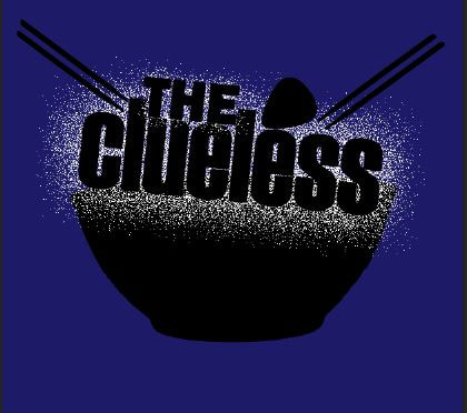
The band website is where all the promotional products for the band come together in one platform. It typically contains anything and everything about the band such as tour dates, their music and album links. For this task I aimed to keep a clean and simple interface and design scheme being careful to maintain a clear layout that isn't too busy for visitors. I also aimed to establish the style of the band through the design scheme and elements such as the guitar silhouettes that depict the rock genre. I kept the semiotics of the whole web page quite literal to the visitor featuring silhouettes of guitar picks and drum sticks. Riddling the site with silhouettes of instruments and musical tools connotes music and musicianship which cannot be mistaken for anything else. I feel that this literal approach works well in immediately associating the band with the rock genre and even gives quite of a playful vibe to the website - targeting a young demographic ranging from teens to young adults. The band logo really gives off a playful atmosphere to the band as it's quite quirky representing the drum sticks as chop sticks to go with a bowl of rice. It portrays this idea of the band hailing from an independent record label as it's completely personal and expressive - mainstream records are not likely to market their clients in such a way. This also reinforces my target towards a younger audience as the youth has become the biggest consumers of music compared to any other age group; while still keeping the overall layout clean and professional. The colour scheme also heavily focuses on contrasting/complimentary colours (similar to the digipak) with the white against black, red against blue and yellow against purple. It adds a subtle but clear appeal to the website as it's not too busy but still visually interesting.
The Header Image
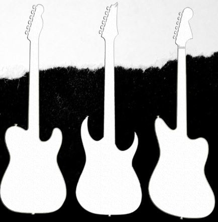
This image is the first image people typically see in a band web page. It immediately establishes the look, style and genre of the band. It's mainly for the benefit of future consumers as existing fans of the band aren't as bothered with first impressions as they already know the band's look and style. For my header image I included the band logo to introduce this idea of iconography, silhouettes of guitars to give a literal interpretation of the band and a band bio in the form of a music critic review. Doing a bio in this style encourages future consumers to listen to their music as listeners nowadays are very selective with their media and will only make time for what they deem is good to their standards, this is especially true being reviewed by a reputable music critic such as Pitchfork.
Pitchfork is an active, commercial, American online music magazine website owned by Pitchfork Media Inc. that places heavy focus on independent music. The site exclusively looks at new and upcoming music and is a well known music blog known by many consumers in the indie music scene. Knowing this fact, I felt that it was very relevant to the type of music and band I am promoting, adding that extra layer of appeal to future consumers. The fact that an American music magazine has recognised an international act will truly create a buzz among the independent music scene which was the very idea I wanted to portray.
The logo is on the top left corner of the image which establishes the band's identity. It's also positioned there as it will be the first thing people will be drawn to similar to the logic that words are read from left to right. The logo is also the biggest image in the whole header layout to again promote this sense of band imagery.
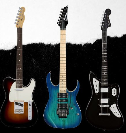
The guitar silhouettes are meant to literally represent and connote the rock genre as it is an instrument that was popularised by the rock genre despite being used in other genres. The significance of there being three types of guitars is meant to mirror the three band members in the group. Having different types is meant to represent that all three of them have different personalities and fans are left to guess which of them correspond with who.
The background image is a simple black and white contrast split by a paper tear. This reflects on the band's scruffy demeanor and is meant to reinforce a disheveled and rebellious appearance that sets the tone for the rest of the website.
Pitchfork is an active, commercial, American online music magazine website owned by Pitchfork Media Inc. that places heavy focus on independent music. The site exclusively looks at new and upcoming music and is a well known music blog known by many consumers in the indie music scene. Knowing this fact, I felt that it was very relevant to the type of music and band I am promoting, adding that extra layer of appeal to future consumers. The fact that an American music magazine has recognised an international act will truly create a buzz among the independent music scene which was the very idea I wanted to portray.
The logo is on the top left corner of the image which establishes the band's identity. It's also positioned there as it will be the first thing people will be drawn to similar to the logic that words are read from left to right. The logo is also the biggest image in the whole header layout to again promote this sense of band imagery.
The guitar silhouettes are meant to literally represent and connote the rock genre as it is an instrument that was popularised by the rock genre despite being used in other genres. The significance of there being three types of guitars is meant to mirror the three band members in the group. Having different types is meant to represent that all three of them have different personalities and fans are left to guess which of them correspond with who.
The background image is a simple black and white contrast split by a paper tear. This reflects on the band's scruffy demeanor and is meant to reinforce a disheveled and rebellious appearance that sets the tone for the rest of the website.

|
|
Making the logo, I simply put images I found from Google Images into a the look I wanted to achieve by placing them similar to a bowl of noodles with chopsticks.
|
|
I then silhouetted the whole image to make it more flat and less literal. It now looks more of a logo rather than random images put together. This was initially going to be my first draft, however I wanted to place more focus on the text rather than keeping the image flat.
|

|
|
|
I added a splatter effect that may directly or indirectly be associated with rice grains - again adding to the playfulness of the logo and website.
|
|
Adding the guitars in was based on each band member's favourite guitar model. It adds a little "easter egg" for existing fans as they will have known this, assuming that they have seen interviews featuring the band. Each guitar has a different shape and is a different type to the other - suggesting that each band member has their own distinct style and personality but in essence they are still working together to make a common product.
|
|
|
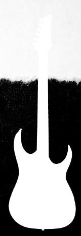
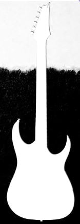
I added a silhouette by putting a white overlay over the image. This adds a sense of mystery and leaves fans to decode what model of guitar it is and try to associate it with a band member that most likely favours the guitar.
|
|
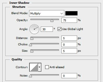
Again, the image appears flat and it doesn't stand out very well with the white section of the background image. So I added inner shadows to create a distinction between the background and foreground.
|
|
|
|
|
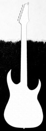
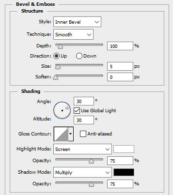
I then beveled the image as the left side of the image still didn't stand out. It now adds a clear outline/border around the image that lifts it up from the background.
|
|
I added a slight texture as a finishing touch just to conform to the disheveled appearance I am trying to replicate in cohesion with the background image.
|

|
|
The Backdrop
|
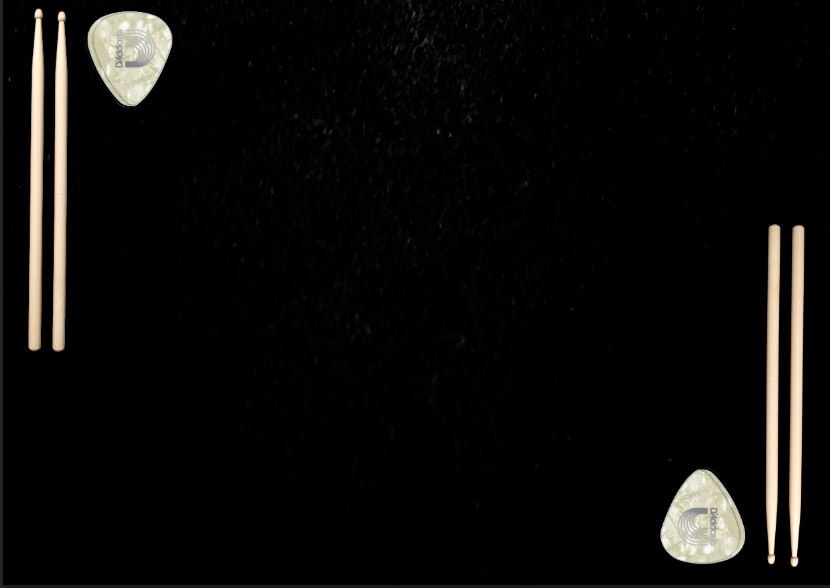
To the left is the layout of the backdrop, it's a very simple and spacious image as the music video will be featured on the foreground. I left the background black to continue from the header, adding continuity as you scroll down the. The guitar picks and drum sticks are placed on the side of the page mirroring each other in an x axis. I wanted to replicate these objects being placed on a table, however keeping these raw images do not go with the theme of the website and strikes out unappealingly.
|
|
I added a simple colour overlay of blue and red to conform to this idea of contrasting/complementary colours working in the same light as black and white which is heavily featured throughout the website. This creates a more professional and put together outlook onto the backdrop and is a subtle design that doesnt take away from the focus which is the music video.
|

|
Below is the final look of this section. I feel like the thumbnail really works in promoting the band's album and just further establishing the fact that it is a music website. It's the first exposure future consumers will have of their music and therefore is fits in setting the right impression to fans of the genre but not of this specific band.

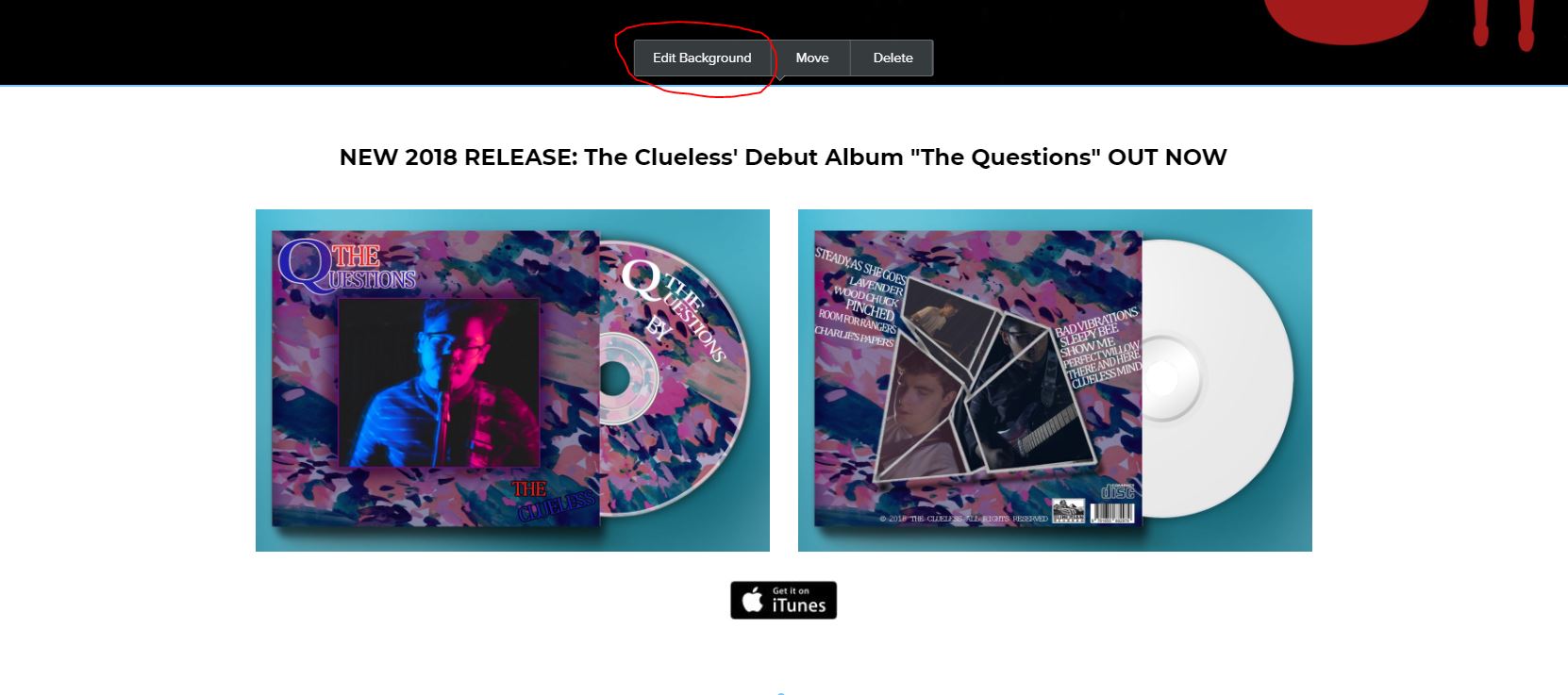
The Album Page
Following on from the music video - I've intentionally "teased" the theme of the album by showing the disc decal prior to getting to the album promotion.

*Please see digipak page to see how I've produced my digipak products if you haven't seen already.
|
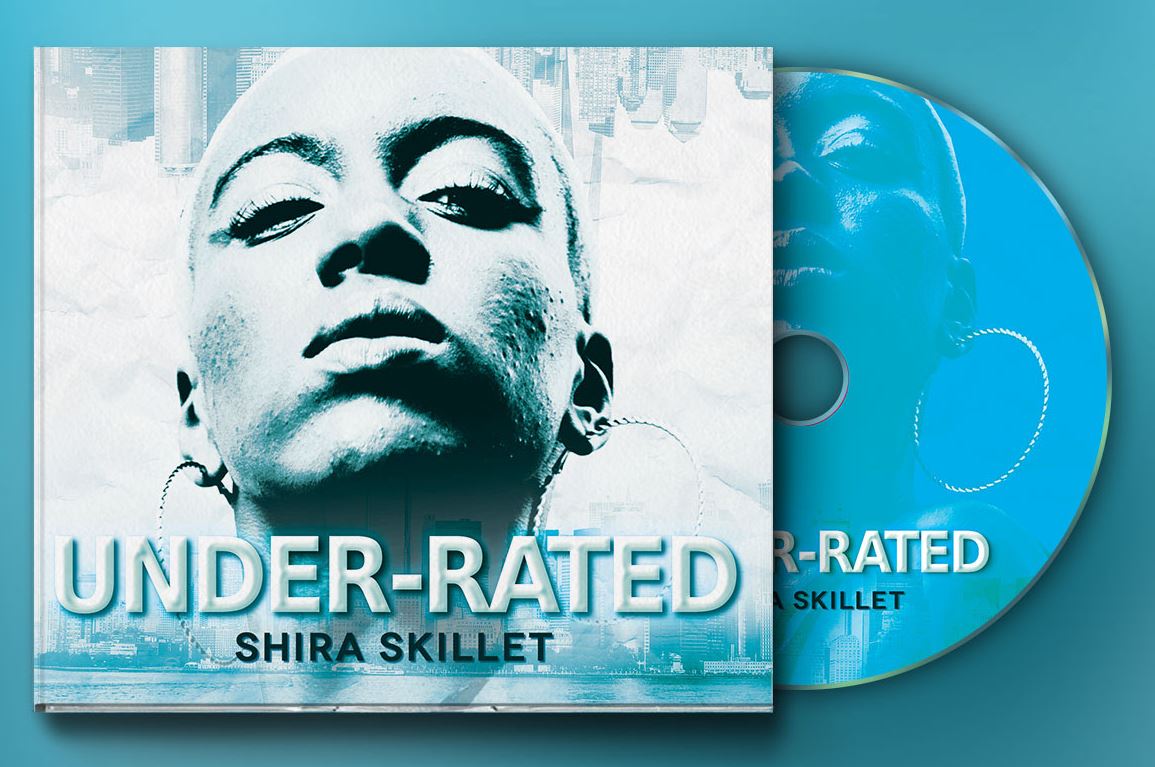
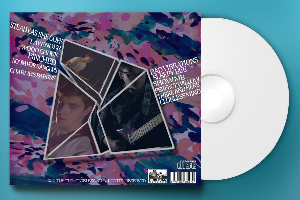
To the left is the "template" I used for creating the promo images for my digipak set. Creating the promo from this image was a very easy and simple process of adding my own work on top of the existing image as a separate layer to imitate the layout of the original image. It was also the same process for the back cover of the image. |

|
|
|
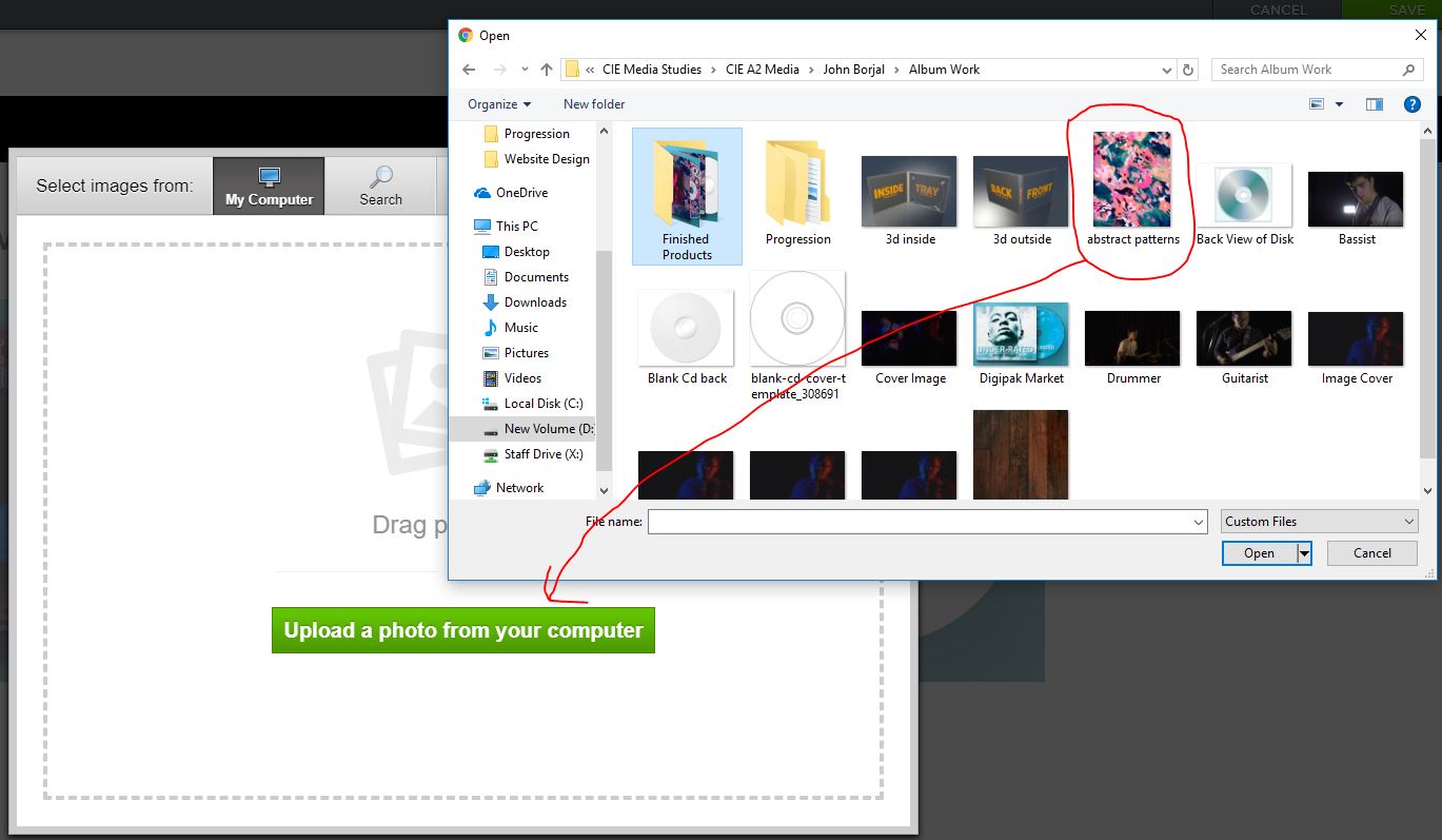
After adding appropriate text and iTunes link on the page which was a very simple case of adding text and images onto the page as standard, I had to change the background to make the page more visually appealing cause at it stands it's very easy for people to gloss over this page.
|
|
I simply used the "Replace" option to deviate from the plain default white background and changed it into the abstract texture that is heavily featured in the digipak - further encouraging a sense of house style.
|
|
|
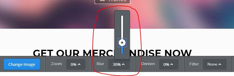
I then added a blur to the image as leaving it as is left the page flat and too one dimensional. Adding a 30% blur leaves the focus on the promotional images but still makes the page as a whole visually striking. Separating the page from the rest of the website. This design choice was made to encourage consumers to purchase the album.
|
The Merchandise
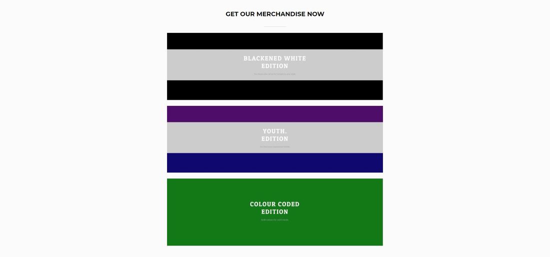
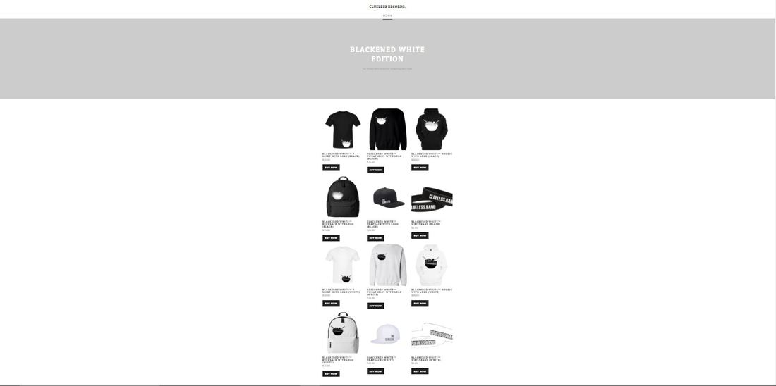
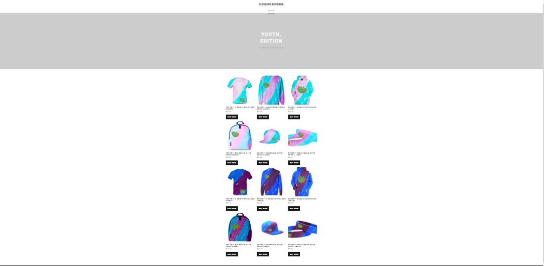
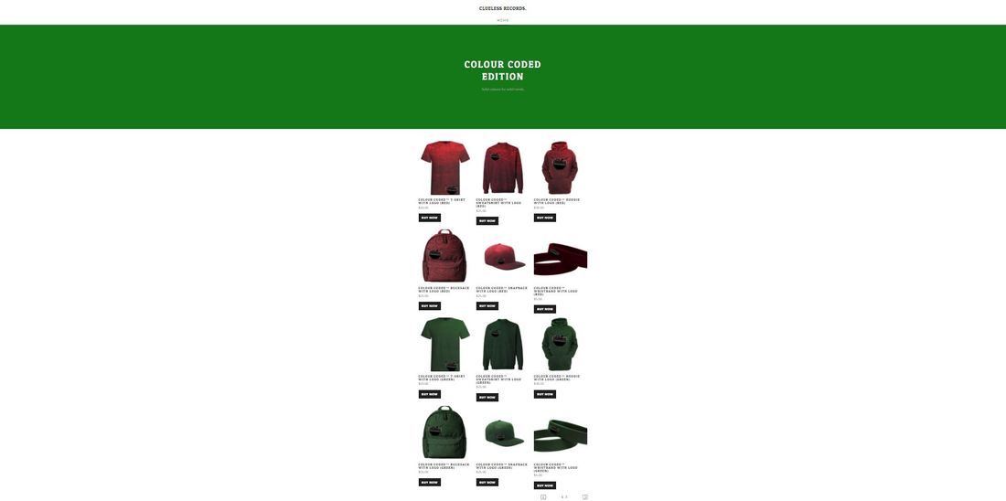
My merchandise features three different design choices and aesthetics. The products themselves range from hoodies to backpacks which are common products that teens use and wear on a regular basis. This encourages a successful line of products that are not limited to an aesthetic niche but rather a wider utility for consumers to use everyday in addition to their fashion sense.
In contrast to the album promo section, the merchandising conforms to the original design template of the website as a whole. This is to make sure that the website is still consistent and professional throughout by avoiding common design pitfalls of making band website pages look too busy and hectic.
In contrast to the album promo section, the merchandising conforms to the original design template of the website as a whole. This is to make sure that the website is still consistent and professional throughout by avoiding common design pitfalls of making band website pages look too busy and hectic.
I simply placed the header images from each dedicated merchandise webpage into one column to give consumers several difference design options and choices for their liking. When they click on their desired option they are then taken to a dedicated website specifically made for that brand of merchandise that are all owned by "Clueless Records."
|
|
|
All webpages are in a very identical layout to keep things simple and professional as the main focus should be the products themselves. They are all neatly arranged in rows and columns so that consumers can view the whole collection at once. I consciously laid things out as is to encourage costumers to buy the collection as whole once the see what all the products together look like. Many online stores to this when promoting a specific new line of products and to appeal to die hard fans. The most time consuming process was perhaps making the products themselves due to the sheer amount of products and difference design aesthetics there are for each line of products.

|
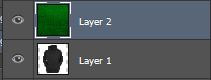
This process is the same with all the other products. I start off with the one of the products in either black or white - in this case I chose black for demonstration purposes.
|
|
I then pick out the desired texture to overlay onto the product to change the style and look of the hoodie or whatever product I am working on in the current moment.
|

|
|
It is important to place the texture layer on top of the product so that the colour/texture blend into the hoodie rather than the hoodie blending into the background. Doing the latter gives a similar result but putting the texture on top is a more logical option.
|
|
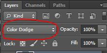
I then add in a colour dodge on the top layer so that the texture falls onto the main product giving it the illusion that the hoodie is now green and stylised differently despite it being the same hoodie at it's core. Overlay option gives a similar effect but colour dodge just makes it more realistic and less "cartoon" like.
|
|

|
After adding in the overlay, I then proceeded with putting the final logo onto the product. These are a selection of logos I made beforehand to suit each and every option. In this case I went for the black variant as it works against any colour.
|
|
Very straightforward, I simply placed the logo on top of the whole image and positioned it to the middle of the product. I resized the logo as appropriate and below is the finished image.
|
|

|
This is the final product and again the same process goes for all the products, just with varying texture and colours according to the design scheme I am working in (e.g. Youth Edition)
|
