Completed Digipak Collection
|
|
|
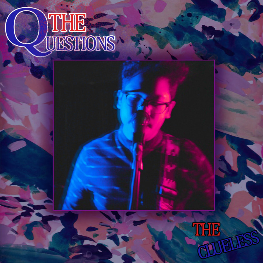
For my digipak I wanted a really colourful and youthful design scheme that at the same time caters to all ages from the teens to even adults. I wanted to represent the band in different lights whilst still retaining their core persona across the audience. Having a colourful design scheme such as the above also attracts future consumers setting it apart from other albums they may see in record store shelves or even online. Throughout the whole project I focused on the idea of contrasting/complimentary colours such as red against blue and black against white. I felt that doing so makes the whole marketing of the band attractive and interesting which proves to be effective based on student feedback that I have been given. The design for my digipack is very abstract in as it incorporates geometric shapes and abstract background textures that establish a home style to the package. Retaining a home style is important as it helps with the band image, iconography and genre. It definitely gives the consumer an indie rock atmosphere which is a genre I am quite familiar with. I also consciously used stills from the music video itself to introduce the notion of cross promotion between the digipak with the music video. I wanted to experiment a little with how digipaks are usually designed where the front cover is typically the most appealing and interesting part of the package. I do acknowledge the fact that it sets a first impression which is why designers tend to do so, however I felt the the background image is sufficiently attractive on its own hence the more simple approach to the front cover in contrast to the back cover. In the end it was all down to personal preference and style and I felt that I have expressed it effectively in my digipak package.
Creating the Digipak
For the front cover I wanted to have a simple layout that immediately makes a statement of the style and genre the band is working in. Creating the front cover is shown as follows:

|
I began by using a colourful, abstract background pattern in a 900x900 Pixel square to serve as a basis for my album digipack. I then added a blue overlay to bring down the brightness of the image as I wanted the main image to pop out.
|
|
I proceeded to use this image taken from the music video as I liked the complementary colours. Also the framing of the image is spot on for the purpose I wanted to achieve.
|

|

|
I then colour corrected the image to make the colours neon bright just to set the foreground away from the background making the image less flat. Also change the red to a more purplish tone as the red didn't fit with the abstract background image.
|
|
Adding the main image to the background now creates a clearer structure to me. I can also see how the colours on the main image compliment the background image. However, the main image is quite flat on the background and looks quite amateur.
|

|

|
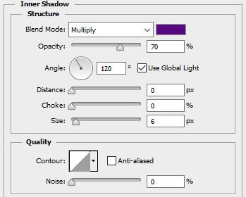
I added drop shadows, inner shadows and strokes to the main image to make it pop out and look visually appealing. I also made sure to make the colour scheme consistent throughout hence the following effects in purple rather than black or white, which is the colour these effects are usually set in by default.
The drop shadow adds an outer 3D dimension by reducing the distance until the drop shadow spread out from the center outwards rather than splitting at an angle. |
|
The inner shadows adds further depth into the main image making it less flat. Again the distance has been reduced in order to shift the center of the image as the focal point.
|
|
And finally, the strokes add a border around the image making the separation from background and foreground clear to consumers as the ultimate goal is to immediately draw attention to the center of the cover.
|
|
To the right is the final outcome with all the effects on the main image. I feel that I have achieved my goal of making the main image the focal point for future consumers along with the complimentary colours and neon bright lighting. All that is left to do is add the text.
|

|
|
Here is the raw text, again it is quite flat on the background image and not very easy to see.
|

|
Adding white strokes around the image makes the text much clearer to the consumer. However I don't like the plain black as it still doesn't look captivating enough.
|

|
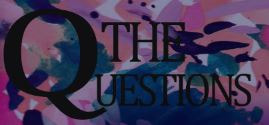
The red and blue colour overlay really livens up the look of the text and now looks visually appealing.
|
|
I created a final touch to the text by adding a "paint splatter effect" by playing around with the outer glow effect. This effect reinforces the visually striking appeal of the front cover. It also instigates a messy, rebellious demeanor that the rock/punk genre typically portrays. Although subtle it does still add to the text and overall look of the front cover.
|


|
The band name was just a simple colour overlay with black strokes. I skewed the "Clueless" text to add another dimension and making the layout less conspicuous - subconsciously drawing attention the text as well. I also wanted to replicate a stamping effect on this text by adding the skewed layout.
|

|

FINISHED IMAGE
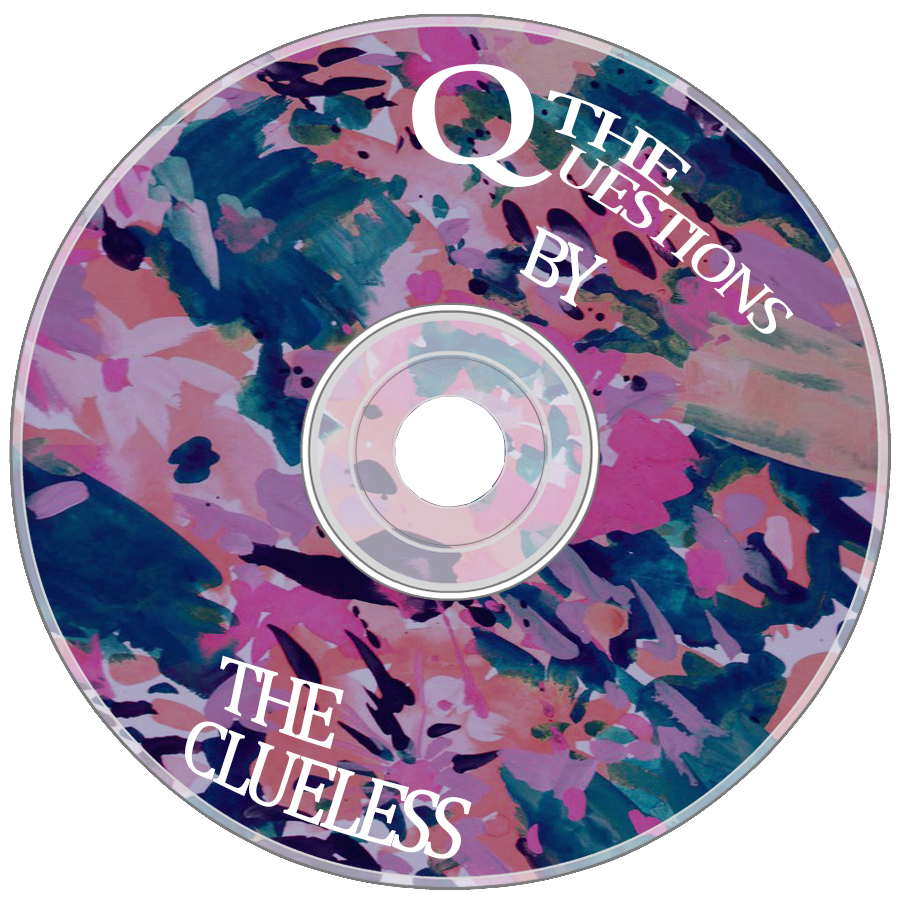
The disc design was quite straightforward as it's not the main attraction of the digipak. So I kept things simple making a conscious effort to keep a clear house style across all three elements of the package.

|
I placed a simple disc template onto a 900x900 Pixel square canvas on Photoshop. I made sure there was no background layer as I will be working on the disc template exclusively and not the square canvas.
|
|
I then added the same abstract background onto the canvas and selected the outer layers that I will not be including in the disc template. I also then later added the same blue overlay to bring down the brightness of the background identical to the front cover.
|

|

|
This is the final basis for the design. All that was left to do was add the text and we should have the completed disc design.
|
|
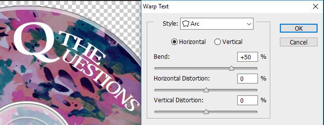
I then warped the text in shape with the spherical shape of the disc using the "Warp Text" effect upon selecting the text tool in photoshop. This adds a more professional look and I feel to the product. I also avoided using other images other than the abstract texture as it is already a busy design that has no other need for secondary images - this would look very clunky and unprofessional which may deter future consumers from buying the product.
|
|

FINISHED IMAGE
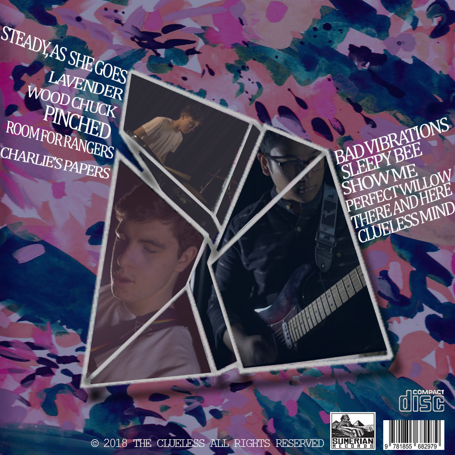
The back cover was where I wanted to break up the construct of a strict square shape by introducing a geometric shape into the cover. This is perhaps the most visually striking aspect of the whole package which was a conscious decision on my part.

|
This was the geometric shape that I wanted to work with. I wanted to replicate a collage effect onto the shape and I felt it gave me many dimensions and angles to work with which certainly gave the complete image an appealing and interesting look. I started off with a black background as I wanted to purely focus on the shape.
|
|
For the images I took stills from the actual music video to again cross promote both products. I placed the image in a manner that fit right with the shape which took a lot of trial and error. This was the end shape and look that I wanted to achieve.
|

|

|
I then started to cut the image up to fill in the shapes. This was done using the polygonal lasso tool, outlining the shape and then creating a new layer based off the selection made with the lasso tool. This gave a very dynamic effect to the collage of images.
|
|
This is what the final cut looks like in one section of the shape. I then repeated the same process for the bassist and the drummer which were also stills takes from the music video.
|

|

|
I then wanted to add a colour overlay based on the hues in the background image. These are the colours I wanted to use which was a mixture of all the different tones taken from the background image.
|
|
Reducing the opacity to 30% gave a colour filter to the images which now looks even more interesting and portrays a creative take on the collage.
|
|

|
Research on Digipaks:
Cover Art
Traditional marketing methods have always incorporated cover art in a plethora of tangible items such as vinyl records, CDs, cassettes and other media. They were initially designed to grab the attention of a potential consumer and serve as a first impression to the album. In the early ages of the music industry, cover art or album covers played a big part in appealing to consumers as there were little opportunities for buyers to listen to previews of the album. Here's a comparison of classic cover art compared to more contemporary albums:
Traditional marketing methods have always incorporated cover art in a plethora of tangible items such as vinyl records, CDs, cassettes and other media. They were initially designed to grab the attention of a potential consumer and serve as a first impression to the album. In the early ages of the music industry, cover art or album covers played a big part in appealing to consumers as there were little opportunities for buyers to listen to previews of the album. Here's a comparison of classic cover art compared to more contemporary albums:
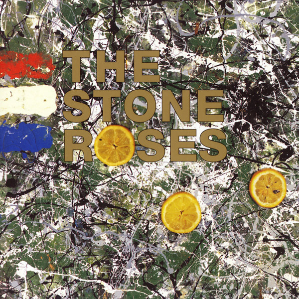
The Stone Roses - "The Stone Roses" (1989 Release)
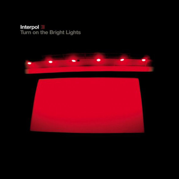
Interpol - "Turn on the Bright Lights" (2002 Release)
|
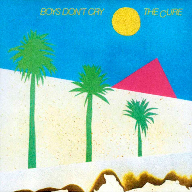
The Cure - "Boys Don't Cry" (1980 Release)
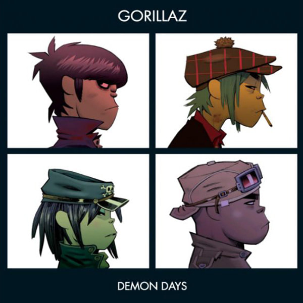
Gorillaz - "Demon Days" (2005 Release)
|
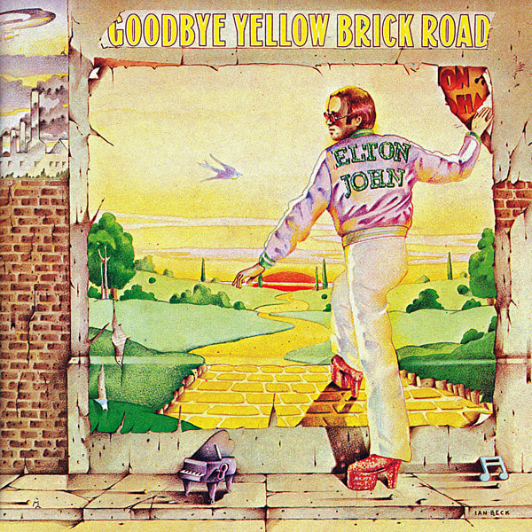
Elton John - "Goodbye Yellow Brick Road" (1973 Release)
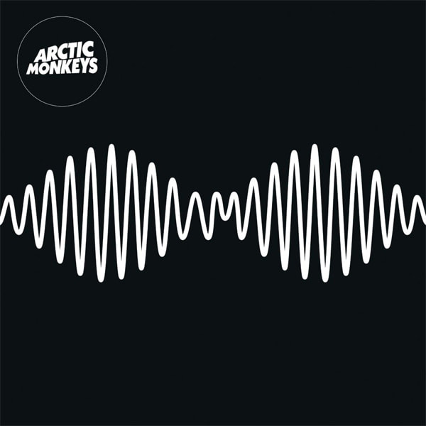
Arctic Monkeys - "AM" (2013 Release)
|
More contemporary releases lean towards a more simplistic and neat style to perhaps portray the impact the internet has on modern day music marketing. The internet age has greatly impacted the way we consume and purchase music as we can now stream whole songs on demand. Because of this, there is less of a need for artists to reach out to listeners via tangible goods and consequently, the importance of how appealing an album cover is has dwindled in value. How eye catching and creative an album cover was used to correlate with it's record sales for a variety of reasons:
- Consumers are fans of the artwork
- Consumers are fans of the music
- Consumers are already existing fans of the artist
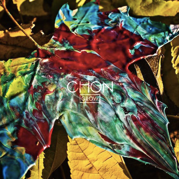
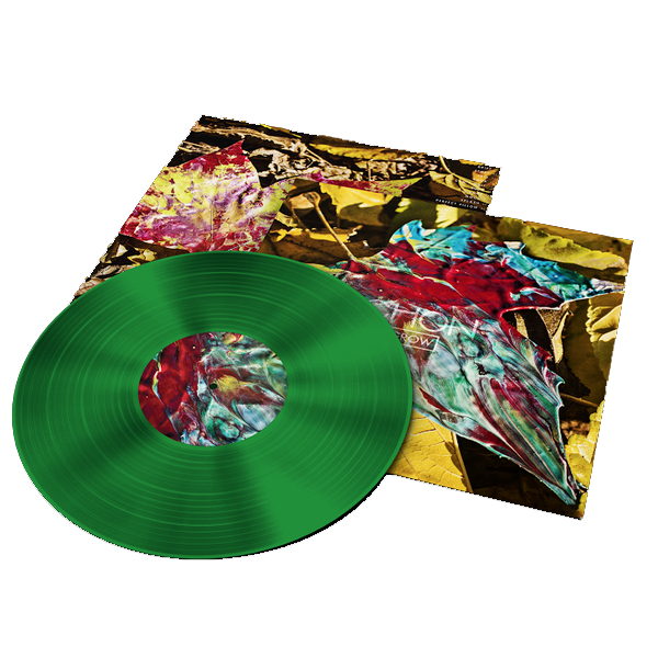
Chon - Grow (2015)
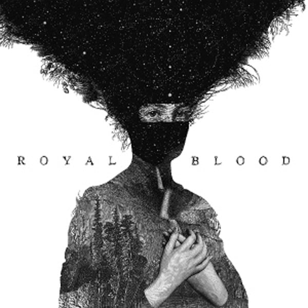
Royal Blood - Royal Blood (2014)
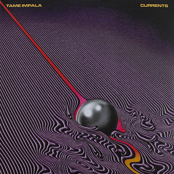
Tame Impala - Currents (2015)
|

Chon - Woohoo EP (2014)
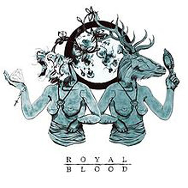
Royal Blood - Out of the Black (2014)
Tame Impala - Lonerism (2012)
|
Chon - Homey (2017)
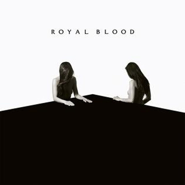
Royal Blood - How Did We Get So Dark (2017)
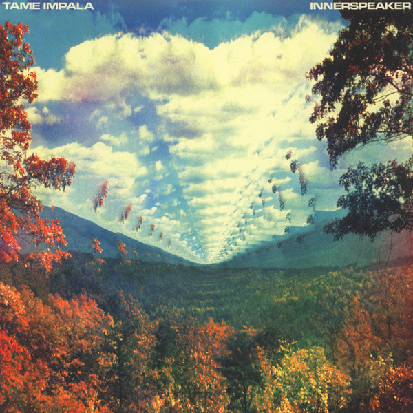
Tame Impala - Innerspeaker (2010)
|
The examples above have served as my inspiration for my own digipak, comparing it with my package you can really see where my influences shine. I wanted to have the lush, colourful palette of Chon coupled with the abstract imagery of Tame Impala and the simple contrast with black and white of Royal Blood's albums. Musicians often express their style and genre through distinct art styles. Already, without listening to their music - the audience can have a sense of what their music will sound like based on their distinct aesthetics - this is intentional. Listeners will always seek to match visuals with music, it's simply human nature and the industry works towards satisfying these unconscious tendencies.
We can split the use of cover art into two generations; internet and pre-internet eras. This is because the use and appeal of cover art has evolved drastically.
Pre-internet era -
The history of cover art dates back the 1938 when Columbia Records hired Alex Steinwess as their art director. Steinwess decided to replace the plain packaging that CD vinyls came in with more expressive cover art. It serves as an expression that represents artists and encouraged symbolism and iconography. Album art evolved into pop culture during the "Rock & Roll era" (1960s-70s) and heavily influenced the movement. Album packages became more diverse as record companies added gatefolds, lyrics pages, sticker inserts, extra sleeves, poster inserts and many other promotional elements.

These additional promotional tools typical gave consumers deeper insight into the artist or band - an invaluable resource for both future and existing fans alike. Crafting an aesthetic specific to the artist gives audiences an incentive to collect more and more of the band's merchandise. Humans by nature are very visual beings and love owning a specific type of aesthetic they are a fan of usually out of impulse - and the industry works to satisfy these needs. Having a specific house style is vitally important when promoting an artist as it is this very house style that record labels love to market to listeners - without an established house style a visual it will be quite difficult promoting an artist, especially if they are an upcoming act. This becomes less and less important as the artist becomes more established and acquire a more loyal fanbase - however they still have to be careful not to completely deviate from the house style they originally portrayed - although there have been some cases of this happening this is most likely to create a controversy and point of discussion for fans and the outer public eye.
Rock stars of the 1960s-70s era had a very glamorous lifestyle that was to be fabricated by record labels on tangible products such as vinyl records. This spiraled into no longer a fabricated tangible product - but into a youth culture. Even today we still see the glorification of the rock lifestyle with bands such as the Arctic Monkeys evolving into a more classic rock aesthetic as well as Metallica and Iron Maiden shirts being sold in a more contemporary age.
Rock stars of the 1960s-70s era had a very glamorous lifestyle that was to be fabricated by record labels on tangible products such as vinyl records. This spiraled into no longer a fabricated tangible product - but into a youth culture. Even today we still see the glorification of the rock lifestyle with bands such as the Arctic Monkeys evolving into a more classic rock aesthetic as well as Metallica and Iron Maiden shirts being sold in a more contemporary age.

|

|

|
Internet Era -
Digital albums also contain artwork but it is not a dominating feature on the product and simply acts as a branding and identification for the band's music. Nowadays people likely purchase albums because of a few popular singles that were part of the album that they have likely watched or heard from streaming sites such as Soundcloud, Youtube and Spotify. The connection between the audience, and the story created by the artist is dwindled as the listeners only focuses on those popular singles. Concept albums are simply not made anymore due to the pacing evolving interest of music consumers. The fact that the digital age allows consumers to purchase specific tracks and personalise their music library renders the appeal and aesthetic of album artwork and packaging into of decreasing importance.
However, recently there has been a resurgence of vinyl collections in the 21st century and pre-internet views on album packaging and artistry have been revived.
|

|
|
Cover art has to work in cohesion with other promotional tools such as music videos and merchandise. It is not uncommon for vinyl and album covers to feature styles seen in music videos and merchandise as it promotes the artist's house style - again cultivating a culture around the artist and music.
